
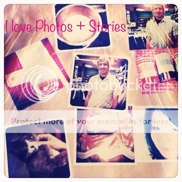
This week I have some Instagram photos, along with a photo collage. So I printed them on a sheet of 8.5x11 photo paper.

And then I trimmed them. This is actually a photo of the photos laying on my desk. I used the apps Pixlr-o-matic and LINE Camera to create this photo.
On to Week 17:

Left side. We went to the Taste of Hillcrest and tried out bites from 26 different restaurants! I got to visit Sally and her new twin babies. I got a haircut.

Just a simple week title page this week. Had an extra photo of Noodle laying on Todd's lap.

The journal card on the right are Duality customizable journal cards (digital) by my friend Peppermint Granberg of One Little Bird. I journaled around the circle with a pen.

This side was all about the Taste of Hillcrest. The journal cards are Shifted journal cards (digital) by Robyn Meierotto. I thought the colors really went well with my photos.

Speaking of journal cards, I printed out all of them onto a sheet of 8.5x11 matte photo paper and trimmed them. Some are for Week 18.

Right side. (Otherwise known as the slightly-garish-side.) :p We went running at the lake, and I had a "protein-style" In-N-Out burger for the first time. No bun! I started drinking chocolate chai tea with soy milk in the afternoons at work, because it's caffeine-free. I carved a cassette tape stamp. I found some washi tape at Target. I started to crochet a chevron afghan. We took a day off and went to breakfast in Hillcrest.

This is the brightly colored, slightly garish slot. Oh well, it's done, ha ha.

I made this "polaroid" frame by punching a square with my Marvy Uchida square punch. Then I trimmed around it. Super-easy!

The "today" is from a new stamp set by Studio Calico called Oh Happy Day. I stamped onto white cardstock first, then used my Martha Stewart starburst punch and punched them out and adhered them onto my page. I really like how it looks! I had this 4x6 journal card with the border sewn on ready to go, from when I had my journal card mass-production session.

The journal card on the ride side is also from the journal card mass-production session. The stamps were from the April Studio Calico kit.

I made a 8.5x11 insert with all the food that we ate at the Taste of Hillcrest.

When you look at the insert, it's right next to the journaling and other photos from the same event.

The back has the map and list of all the participating restaurants and our punch tickets for the event.

And that concludes Project Life Week 17! I have some new blog readers who have come from the Everyday Storyteller blog hop, or from Write Click Scrapbook (where one of my Project Life pages was featured), or from my Project Life article at My Scrapbook Art. Wherever you've come from, I just want to give you a warm welcome and let you know that I'm glad you are stopping by! Please leave a comment if you so incline. I love to hear from you! :)
2012 Project Life | Week 17 Supplies:
Gosh, that's not garish to me in any way--totally awesome, in fact!
ReplyDeleteDitto what Heather said! I LOVE your use of colour, Christine ... it's bold, bright & absolutely beautiful!
ReplyDeleteTotally not garish at all! It's totally on key with the photos and rocks! I love how you explain the bits and bobs. Great details and now I have to get those journal cards! Still totally envious of your mad carving skills!
ReplyDeleteI guess I must have the same taste you do because I like the green. I would not re-do it. I like green though. It's funny because I would not say green is my favorite color (I don't think I have one) but I hoard green . . . green ink pads, green papers, green ribbons. There is so much you can do with green. :)
ReplyDeleteLove looking and reading your PL. Thanks for sharing so much.
I don't think it looks garish either. :) Great pre-planning on the journal cards/pix -- I tend to do them individually instead of printing on one sheet, and this way makes a lot of sense. I like the stamping and then punching too -- don't know why I never think of that. Your pages are very inspiring. :)
ReplyDeleteCarmen (new reader via Write.Click.Scrapbook). :)
oh i love this page too!! definitely not too bright (although i really LIKE bright things (and green LOL) - so maybe i'm biased) ... and that 'saturday' card is so pretty too ... i loooove your pages!
ReplyDeleteI LOVE the bright colors! Not the least big garish, it's gorgeous!
ReplyDeleteI'm not a fan of all the beige and washed-out shades that seem to dominate layouts these days, they are so bland and all end up blending together and looking the same.
This comment has been removed by the author.
ReplyDelete